Thank you for your coming. This page is telling about color
preferences in Japan. In general tendency, there are differences
between Pure preferences in colors and Merchandise preferences in
colors, as you know.
For example, In Japan, People like (as merchandise colors) black,
navy blue, white, beige, light gray, charcoal gray and brown. In
recent years younger people tend to take more vivid colors just
like in 60s colors, such as lime, orange, yellow as for garments
or household goods. Of course, in these areas, the color
preferences are always moving like waves. How would you like to
say in your country?
In this page, I tell about Pure preferences in Japan based on the
web color research from April to July 1997. The cooperators to
this research are 117 people. This number of people is not so
many, but you can learn about an outline of color preferences in
Japan.
Men like blue and ladies love pink. As you see at the table
below, Men like blue, light green, turquoise etc., or cool colors.
Ladies' colors are light pink, strong pink, red etc., which are
reddish and warm ones, and next to these, turquoise, blue and
purple.
In this results, generally say, Male like Bluish colors and
Female like Reddish ones. This is very Japanese tendency in color
preference. And as to the width of selected ranges on colors,
ladies have more variety than men's.
| total | Male | Female |
|---|---|---|
| 13-15 | 16-18 | 19-22 | 23-29 | 30-39 | 40-49 | 50-59 |
|---|---|---|---|---|---|---|
| - | ||||||
| - | ||||||
| - | - | |||||
| - | - | - | ||||
| - | - | - | ||||
| - | - | - |
Here you see the result on the left table. The cooperators to
this research are not so many that I do not show selected
rate but only well selected colors. In general, they tend to
select light or strong colors.
As to the relation to recent fashion trends in Japanese market,
60s or 70s feeling is popular, plus brown has got also fashionable since 1995.
In this connection, yellow,
orange ,lime and brown are remarkable.
This result is taken from a very simple question that only asked
"What is your most favorite color?". The selected
colors like this are called "Pure preferences". In pure
preferences, there are world wide trends that people love BLUE,
and if you say about preferences in numbers, 7 is the best. So
that this tendency called "The law of Blue Seven". In
this point of view, the law is just fittable to this result too.
Next, I tell about the Hue. The Table below is
the result on the hue selected. In this table, black means
Neutral colors such as white, gray and black. From your left side
of the table, you can see total, male, female and ages.
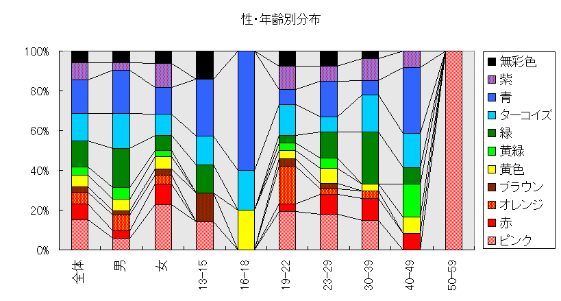
Also in this
analysis, the tendency of cool colors in men and warm colors in
ladies is very clear. From age 19 to 49, the rates of warm colors
(total of pink, red, orange, brown and yellow ) are getting down
according to getting up their ages. In warm colors, fashionable
colors such as brown and orange are particulary getting down according to
getting elder. It seems that this tendency shows the difference
of the sensitivity to fashion colors among their ages that
elder people become unconscious to fashion colors. Age 50-59 has
only one people, its result is not reliable.
If you are a color designer, you may be interested in how
to get good selling colors for your goods. How do you feel about
the result of this research?
In Japanese market, people tend not to like aggressive, strong
colors in general except some special cases. If you take some
hints from this research, useable colors are turquoise and pink,
It seems that they are good colors for goods. In fact, these
colors are not so risky in many markets in Japan. In addition to these, light green (this color is called "peppermint
green" in Japan ) is also not so risky.
Preferred colors like this kind of research are sometimes very different
from real merchandise colors as I said in previous section. But I
would like to say that it is worthy to give it a try to use these
colors along with the basic colors in markets such as black, navy
etc. These light colors are seemed to go well with white
especially. Take care not to use in aggressive atmosphere.
Next, I would like to say about the tones of colors. In the table below, it shows the result in tones. From your left side, it shows total, men, ladies and ages. And this time red means strong tone, cream yellow means light colors, gray-grayish tone, brown-dull tone and black means dark colors.
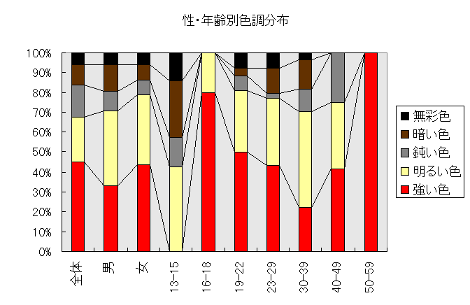
People love bright, clear and light colors especially in this
kind of "pure preferences". This tendency is
not only seen in this research but you can also find the same
in other researchs. Female strongly shows this tendency.
You can also find the same in the result of younger ages,
getting younger, people like pure and light clear colors more.
But you may not always find this tendency in real goods. In
younger ages, they sometimes select darker or sober colors that
give them a more adult look especially in garments. This
"bright color preference" is seen in stationery, tools for
working, etc. which have distance from their bodies and which are used
just like their friends. It may show that color is the reflection of their
mind to goods which they like to have, but they does not select well for their own looks. They may not
want to be seen baby like.
How do you feel about the story above. Finally, I would like to
take this result from a psychological point of view and the tide of
their mind.
 The feeling unconsciously "It's beautiful." or
"I love it." is very important. Because it is an
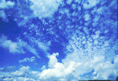
unexpressed part of the mind which people want to get. The color Blue which selected most may show that
people want to be clean in mind just like the clean and pure blue
of the sky and water. On the contrary, it may also
mean that there are too many things being not clear in this
real world. The selection of fresh blue and green seems to show the
wants to go into clean and natural world.
The feeling unconsciously "It's beautiful." or
"I love it." is very important. Because it is an
unexpressed part of the mind which people want to get. The color Blue which selected most may show that
people want to be clean in mind just like the clean and pure blue
of the sky and water. On the contrary, it may also
mean that there are too many things being not clear in this
real world. The selection of fresh blue and green seems to show the
wants to go into clean and natural world.
The age from 19 to 30, green is selected more according to
getting elder. The age 30's is very busy age in their
job, taking care of their children and housekeeping. Rest, peace and healing are typical images of green. They may need rest and peaceful atomosphere.
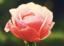 Pink is selected very many by young ladies. In
researchs for color symbols, it is said that pink symbolizes
tenderness, dream, love, hope, femininity, happiness and warmth.
This color pink is very suitable for ladies. In this my research, I
would like to say that they want to have dream, hope toward their
future and to be tender in mind.
Pink is selected very many by young ladies. In
researchs for color symbols, it is said that pink symbolizes
tenderness, dream, love, hope, femininity, happiness and warmth.
This color pink is very suitable for ladies. In this my research, I
would like to say that they want to have dream, hope toward their
future and to be tender in mind.
Younger age 19 to 22, orange also selected many. Orange is
the color of love and the sun or hope. Young is the age looking
for their self identity. Their wants may be to get hopeful
future.
Dream in Pink and Hope in Orange. Dream also means the escape from
reality. The real world sometimes gives you many difficulties.
The color selection seems to show the hopeful mind to their future as
well as the wants to escape from their daily realities.
Finally say, They may need to be clean or to be innocent, to be hopeful, to have dreams and to take
rest. This may reflect the tide that people want to take
the time to think slowly and deeply of their ideal world. They may be
looking for the things which give them something vivid or fresh.
I felt these in this research.
Many thanks to the cooperators.
If you have any opinion about the research, why don't you discuss
in the bulletin board "Color Dream Net Club House"?
Bye!
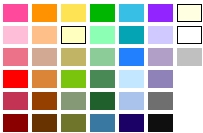 This jpg image was used for the selection. There are 39 colors.
Answered Number : 117 people
Male 51(44%)/Female 66(56%)
The details in ages
13-17 : 7 ( 6%)
16-18 : 5 ( 4%)
19-22 : 26 (30%)
23-29 : 39 (46%)
30-39 : 27 (32%)
40-49 : 12 (14%)
50-59 : 1 ( 1%)
All rights reserved.
If you would like to use this result for some works, please
send your E-mail to info@colordream.net
for the permission.
Return to home